This is part of our Ultimate Guide to Qualitative Software | Start a Free Trial of Delve | Take Our Free Online Qualitative Data Analysis Course
There’s a few different ways to pick the right qualitative data analysis (QDA) software for your research project. Less friction during your coding generally means more time (and focus) you get to spend developing your insights. Clunky or overly complex software ends up pulling attention away from this deeper analysis.
Since most reviews focus on features over workflow, we sat down with ATLAS.ti, Delve, Taguette, and four other top QDA tools to compare what new researchers, students, and even educators say they need most: Which software is easiest to learn and start coding with?
Fewer clicks the better (at every research level)
Every researcher’s coding needs are different. A grad student with a 6 month timeline and very little budget has different priorities than someone running a 3-year funded study with lots of multimedia data.

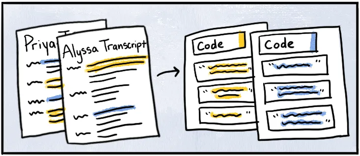
Whatever your project scope, one of the easiest ways to sit down and start coding is with pen, paper, and a highlighter. Find something important, highlight it, and keep moving. It’s intuitive and familiar. The massive challenge with pen and paper (or a spreadsheet) is staying organized as you add more codes and data. The best coding software mimics this natural tagging process but helps keep you organized at scale.
Complex projects need power features and basic projects need simple functionality, but we all want software that keeps coding simple without all the speed bumps. Whether for building straightforward thematic analysis or a deeply layered theoretical framework through grounded theory, the goal is to spend as much time as possible analyzing actual data – not tangling with new software.
➲ Which software is easiest to start coding with?
A few coding software options on this list had us coding in just half an hour, while others require days or weeks to figure out where everything is and how it fits together (NVivo comes to mind). Setup time was an important factor in how easy these tools were to set up and start learning.
Practical reality: Learning curves compounds over time. If you’re working on a six-week analysis project, spending several days learning software eats up a lot of overhead on your timeline. Consider whether advanced features justify the initial investment for your specific project needs.
NVivo
Enterprise-grade complexity with a steep learning curve
Getting NVivo running took us the better part of a week to feel remotely comfortable with basic coding. The setup itself wasn’t easy to navigate. We had to check our receipt to figure out which download to select from all the versions and installation options. Once installed, understanding where everything lives takes serious time investment. NVivo offers extensive training resources, but you’ll need them.
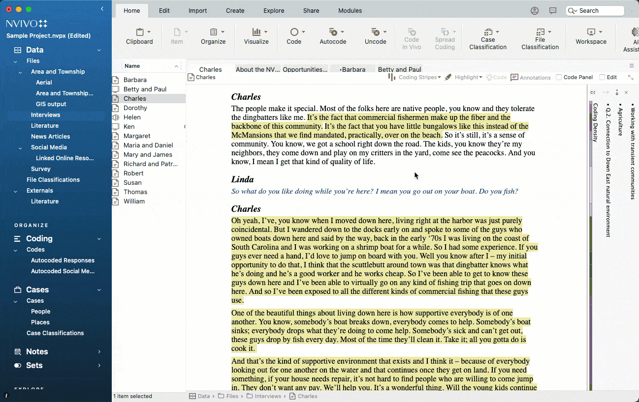
(Data from NVivo Sample Projects)
NVivo handles virtually every data type you can throw at it: text, audio, video, images, PDFs, social media data, and survey responses and importing data is a breeze. For someone running a 3-year funded study with lots of multimedia data, this juiced up approach justifies the learning (and monetary) investment. The desktop version provides full features, while NVivo Cloud offers collaboration features at added cost. The software comes precategorized for interviews, literature, news articles, and social media, clearly built for enterprise-scale data handling.
The coding process involves multiple steps and menus, with four different ways to accomplish the same task – adding to the on-screen busy-ness. But you can create detailed code hierarchies, use automated coding tools, and run complex queries. The coding strips on the right are helpful for seeing what you’ve coded, though you need to scroll within panels to see nested codes.
The reality: As users report, “you need a whole course to learn to work with it.” The interface has been modernized and improved but is still heavy-footed to navigate. Tabs open for everything you click, so you need to manage it like a browser (tab hoarders beware). You get all the features you need then a bunch we never even looked at. The cleaner hierarchical organization is easier to read than some color-heavy approaches in other tools, but many researchers report spending more time troubleshooting than coding.
ATLAS.ti
Comprehensive power with a learning curve
Getting ATLAS.ti up and running took about 2-3 days of setup and training to get comfortable coding. Start by downloading and installing the desktop software (the web version is more limited), then work through their training to understand the interface. ATLAS.ti Academy offers extensive documentation and free webinars, but expect to invest significant time upfront learning where everything is located.
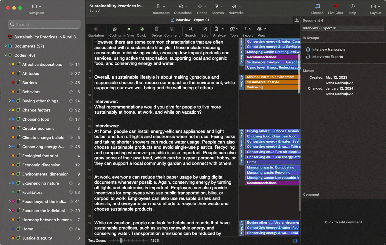
(Data from ATLAS.ti sample project)
The desktop version provides the full feature set but requires installation and setup on each device you use. The web version is browser-based with no installation needed, but currently only supports text and PDF documents (no direct audio/video/image coding). It also lacks some advanced features like network diagrams and complex query tools. Not every project needs that many formats but having the option will save you from converting into specific data types for more complex projects.
Adding a code requires multiple steps and clicks, and ATLAS.ti offers several different ways to do the same thing (at least five by our count). This can be confusing when you’re learning or new to coding in general. You can assign colors to codes so you can quickly distinguish between different types of themes (like separating emotions from behaviors), attach detailed notes to code definitions to remember what you meant later, and build hierarchical structures as your analysis develops. When you code a passage, the code immediately appears in the right margin next to that text. This quick visual feedback shows what you’ve already coded so you don’t accidentally skip or double-code sections.
The reality: As other users report, you have to take specific training courses and experiment for a while to really trust your coding. The interface has eight menu items with various sub-sections in the leftmost panel, and some features (like Network Groups) we never used. With multiple interface panels and an increasingly colorful, code-filled margin, users can easily get overwhelmed rather than productive. Some researchers have also reported stability issues with the web version during intensive coding sessions.
MAXQDA
Comprehensive features with moderate complexity
MAXQDA took us about 3-4 days to get comfortable with the basic coding workflow. Users note that “licensing, different devices and shared projects can get complicated,” but it still beats NVivo. And there’s still a significant learning curve to understand how all the powerful features work together. MAXQDA provides good documentation and tutorial videos that help get oriented faster than with some alternatives.
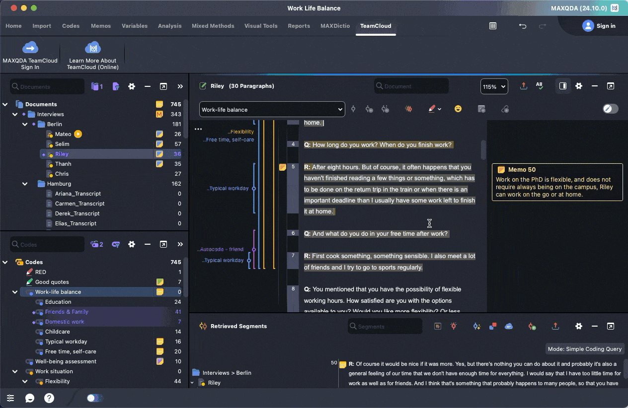
(Data from MAXQDA demo project)
MAXQDA supports text, audio, video, images, PDFs, tweets, focus groups, and survey data. The software excels at mixed-methods research, offering both qualitative coding tools and quantitative analysis features in one package. The transcription features are more user-friendly than most competitors, though we were surprised by slow batch upload performance. Even with just 15 small .txt files, we had to cancel and restart the import process.
Adding codes feels more streamlined than NVivo but still requires several clicks. MAXQDA’s strength is in its organizational tools. You can create complex code systems, use the Smart Coding Tool for automatic coding, and build detailed segment matrices. The hierarchical code structure in the left panel is much cleaner than the color-heavy approaches in ATLAS.ti and Dedoose. When you code text, it gets highlighted with your chosen colors, and the visual feedback is clear and helps you track progress.
The reality: MAXQDA sits in a sweet spot between power and usability, but the interface can feel overwhelming. As one user noted, “the user interface of this software leaves a lot to desire” and the program can be “confusing, especially during analysis.” The four main windows take time to understand, and you’ll find yourself organized but surrounded by so many options you don’t actually need. While there’s a learning curve, the software is stable and reliable once you invest the time to learn it.
Delve
Minimalistic design that’s easy to learn
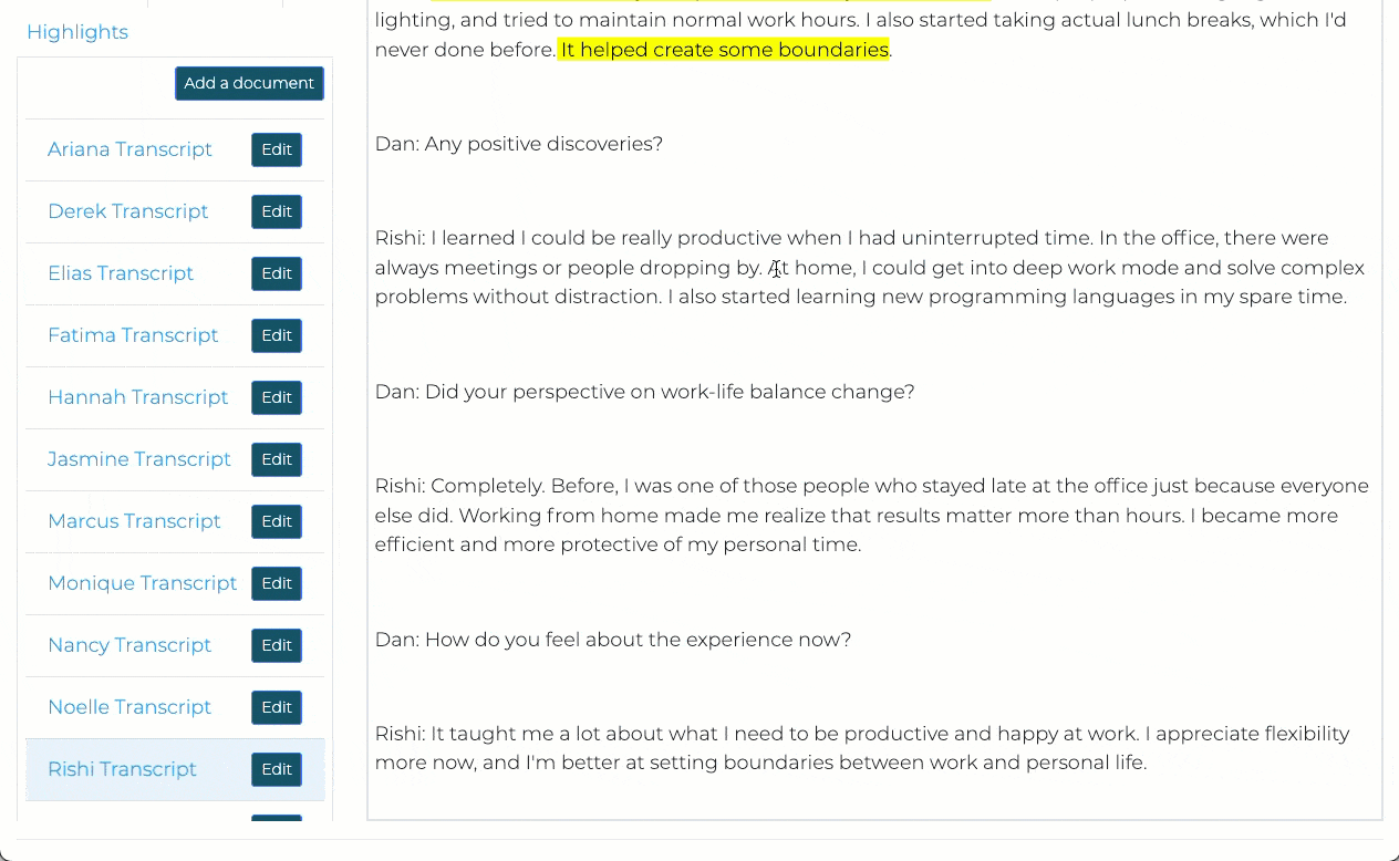
Delve is entirely web-based, so you can set up in 10 minutes and start coding right away. You create an account and can start uploading transcripts one by one or just as easily in batch uploads. No downloads or installations needed. The onboarding process walks you through creating your first code in under five minutes, and a lot goes into our YouTube tutorials that are short and to the point when you need them.
The interface shows your data and codes with minimal clutter, similar to using a Google Doc. The left sidebar shows only one section at a time, so you’re not distracted by competing menus when you’re trying to focus on coding. But transcripts, codes, or other core project elements stay within reach. For new users and students, this focused approach avoids you having to deal with multiple interface panels at once.
The setup mimics coding with pen, paper, and a highlighter. You see something important, mark it, and move on. Color-coded underlines show which codes you’ve applied, making it easy to spot patterns at a glance. Delve’s universal search makes it easy to find any quote across all your transcripts for when you remember someone saying something but can’t recall which interview. The “Search or Add Codes” field is clearly visible (top right) so you know exactly what to do, and you can click on codes and nest them as needed.
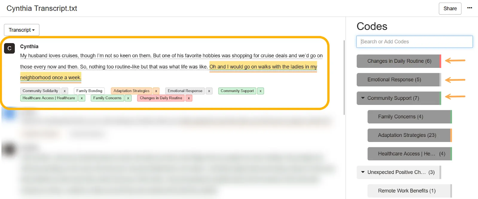
Image - Delve color-coded underlines visually organize your code
The reality: The design makes it easy to understand what you’re supposed to do at each step. The simplicity means fewer customization options than ATLAS.ti – no expandable columns or customized dashboards – but you don’t need extensive training to use it. The choice comes down to whether power features or functionality matter most.
Quirkos
Visual approach with unexpected learning challenges
Quirkos is marketed as the intuitive, easy-to-learn option, but it took us about 45 minutes to get up and running. The visual bubble interface looks appealing, but actually getting started with importing files and understanding how to code wasn’t as easy to pick up as other tools. The approach is so different from traditional QDA software that even basic tasks like adding documents felt unfamiliar at first.
Quirkos handles text-based data well, including PDFs and Word documents, but doesn’t support audio, video, or images directly. The visual coding approach uses colorful bubbles that grow larger as you assign more text to them, making it particularly good for high-level approaches like thematic analysis where seeing theme prominence at a glance helps guide your analysis direction. Once you understand the workflow, the interactivity and customization options are actually quite nice.
With the coding process, you highlight text and either drag it to an existing bubble (code) or create a new one. The drag and drop option didn’t work for us on a Mac, likely due to ongoing compatibility issues. You can easily apply multiple “quirks” (codes) to the same text passage, and the codes do layer deeper than the initial visual suggests. It’s easy to merge quirk bubbles, change colors, customize names and descriptions, but figuring out these workflows initially took some patience. The organizational options are more limited than traditional hierarchical coding systems, but the visual approach grows on you.
The reality: While some reviewers praise Quirkos for being easy to learn and visually appealing, others share our experience of finding the initial setup and workflow confusing. The bubble system works well once you understand it, and the visual feedback can be genuinely helpful for pattern recognition. Some researchers love the fresh approach, while others felt it reduced stability and “made it essentially useless.” The software is reliable, but you may outgrow it as your analysis needs get more complex.
Taguette
Free and straightforward for basic projects
Taguette took us about 45 minutes to figure out that we’d be using the web version instead of desktop – we couldn’t get past the security warnings when downloading the desktop version. If you go the desktop route, you’ll need to keep a terminal window open while working or the program stops running.
Taguette is completely free, which is a big factor for many users. Similar to Delve, the interface works almost exactly like using highlighters on paper. Upload documents, highlight text, and assign tags (Taguette calls codes “highlights”). It’s clean and minimal with your document in the center and your transcripts to the left, making it fairly user-friendly if you’ve coded with physical highlighters.
However, the simplicity comes with limitations for setup and applying codes. While you can import a CSV codebook from a spreadsheet, you still have to take time to upload transcripts one by one rather than batch importing. Adding codes takes a few extra clicks than we’d like and the transcripts leave a lot of white space, requiring lots of scrolling to digest longer transcripts.
The biggest drawbacks with Taguette is that codes don’t display in the margins like other tools on this list, aside from Quirkos. You have to go to the highlights tab to see them, which isn’t great for making deeper connections or spotting patterns across your data. You also can’t layer or nest codes in hierarchies. You can merge them from the highlights page but not organize them into structured categories.
The reality: If you need basic coding for a class project, Taguette gets you started immediately with zero cost. However, researchers have noted limitations like lack of nested codes functionality and word frequency tools. You’ll quickly outgrow it if your analysis becomes layered (most will), and the self-hosting option requires a technical setup that many students find challenging.
Dedoose
Mixed-methods specialist that feels scientifically rigid
Dedoose took about 30 minutes to get things set up. You need to download and install the desktop application, which connects to cloud-based data storage. The interface has a distinctly corporate software feel that can be overwhelming at first. When you open your first project, you’re greeted with six different panels, lots of colors, various sized fonts, and pie charts all competing for attention.
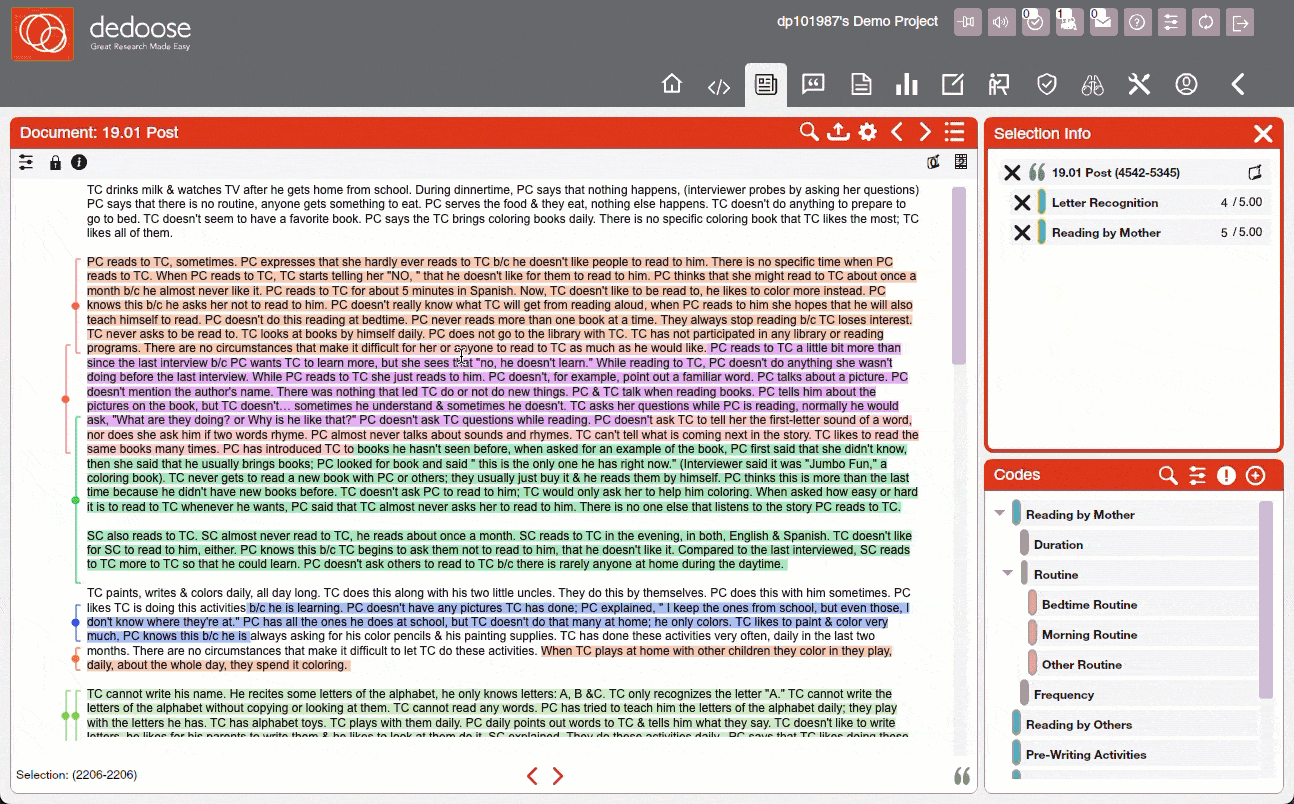
(Data from Dedoose demo project)
Dedoose handles text, audio, video, images, PDFs, and spreadsheets. It’s particularly strong for mixed-methods research (combining qualitative coding with quantitative demographic analysis) where you want to link qualitative codes with quantitative attributes like demographics. You can create charts and matrices that blend numbers and codes without exporting to another program, assign code weights for quantitative analysis, and build complex demographic visualizations. While most tools on this list support mixed-methods work, Dedoose builds its entire interface around this approach. It’s great if you need advanced mixed-methods tools, overwhelming if you just want to code interviews.
The coding process feels more spreadsheet-like than other tools. You highlight text and left-click to add codes, but the text selection is inconsistent. Double-clicking only selects individual words rather than full sentences like in other tools. You can apply multiple codes in different colors to the same excerpt, and the brackets to the left of codes help visualize what’s been coded.
The reality: Dedoose receives mixed feedback on usability. While more user-friendly than a tool like NVivo, users report it as “a massive time sink” that’s “very hard to learn” and “quite hard to navigate.” The browser-based nature means it can get slow with large projects, and some users report freezing issues. The web-based approach eliminates downloads but the trade-off is an interface that feels more like enterprise software than intuitive coding tool.
Takeaway table: What matters for getting started
| Feature | Delve ✓ | Taguette | Dedoose | Quirkos | MAXQDA | ATLAS.ti | NVivo |
|---|---|---|---|---|---|---|---|
| Platform access | Web-only | Web + desktop download | Desktop app with cloud data | Desktop | Desktop (Windows/Mac) | Desktop + web (limited features) | Desktop + cloud collaboration |
| Setup time | 10 minutes (web-based setup) | 45 minutes (web version) | 30 minutes (download + setup) | 45 minutes (unfamiliar interface) | 3–4 days (moderate learning) | 2–3 days (installation + training) | 5–7 days (complex interface) |
| Data types supported | Text, PDF, Word docs | Text, PDF, Word docs | Text, PDF, audio, video, images, spreadsheets | Text, PDF, Word docs | Text, PDF, audio, video, images, surveys | Text, PDF, audio, video, images | Text, PDF, audio, video, images, social media |
| Adding a code | 2–3 clicks (streamlined) | 3–4 clicks (similar process) | 2–3 clicks (spreadsheet-like) | 1–2 clicks (drag to bubble) | 3–4 clicks (moderate complexity) | 3–5 clicks (multiple methods) | 4–6 clicks (complex menus) |
| Learning curve | Gentle (focused approach) | Minimal (basic functionality) | Moderate (corporate interface) | Minimal (visual simplicity) | Moderate (balanced approach) | Steep (comprehensive features) | Very steep (enterprise complexity) |
| Best suited for | Most research projects, all skill levels | Lightweight projects, open-source users | Mixed-methods research, budget-conscious teams | Simple visual analysis, beginners | Mixed-methods research, moderate complexity | Complex projects, experienced users | Large enterprise projects, multimedia research |
📊 Quick comparison summary
Decision time: Matching software to research needs
The question isn’t which tool has the most coding features. The smartest route is to go with the software that aligns best with your coding approach, project requirements, deadlines, and working style.

➲ When Delve’s streamlined approach is better for newer researchers
Choose Delve when you want to focus on analysis rather than software. It should be as easy as possible to add a code without getting sidetracked by the process itself, and the coding workflow eliminates micro-decisions that slow you down. Delve gives you two ways: highlight text and type your code, or use the “Search or Add Codes” field to pre-build codes then assign excerpts. This approach aligns with:
- Interview studies and focus group analysis with straightforward thematic development
- Deadline-driven research where immediate productivity matters
- Researchers who prefer minimal interface busy-ness during coding
- Projects balancing professional-grade analysis capabilities with accessible learning curves
Delve’s strength is all about eliminating barriers between you and your data, allowing analytical thinking to take precedence over software complexity or enterprise-grade features.
➲ When ATLAS.ti’s powerful approach serves enterprise-sized projects best
Choose ATLAS.ti when you need deeply nuanced code relationship mapping, work with tangled theoretical frameworks, or manage large-scale projects where advanced organizational tools justify the learning investment. The all-encompassing coding capabilities suit:
- Large-scale datasets with extensive multimedia requiring sophisticated visual mapping
- Multi-year research projects where advanced organizational tools justify learning investment
- Teams with dedicated training resources and technical support infrastructure
- Studies requiring complex theoretical framework development with hierarchical coding schemes
ATLAS.ti’s strength is providing hyper-powerful tools for researchers and working professionals who need advanced control and plan to use all the powerhouse analytical capabilities.
➲ When NVivo’s enterprise approach serves large-scale research
Choose NVivo when you’re managing massive, multi-year research projects with diverse data types and need the most comprehensive analytical toolkit available. NVivo excels in enterprise environments where teams have dedicated training budgets and technical support. The extensive feature set are made for:
- Large institutional research with multimedia data requiring sophisticated analysis workflows
- Multi-year funded studies where comprehensive training investment pays long-term dividends
- Research teams with dedicated IT support and extensive training resources
- Projects requiring advanced automated coding, complex queries, and detailed reporting capabilities
➲ When MAXQDA’s balanced approach fits mixed-methods research
Choose MAXQDA when you need powerful analysis capabilities but want more intuitive workflows than NVivo. The software bridges mixed method research well, making it ideal for researchers who work across methodologies. Similar to Dedoose, MAXQDA is particularly aimed at:
- Mixed-methods research requiring both qualitative coding and statistical analysis
- Projects with moderate complexity needing organized workflows without overwhelming interfaces
- Research teams wanting powerful features with more reasonable learning curves than enterprise tools
- Studies involving surveys, focus groups, and interviews requiring integrated analysis approaches
➲ When Quirkos’ visual approach suits visual learners
Choose Quirkos when you want visual feedback about theme prominence and don’t mind learning a completely different approach to QDA. While the initial learning curve can be steeper than expected, the bubble-based interface makes patterns obvious once you understand the workflow:
- Projects where visual theme representation aids understanding after initial setup
- Researchers willing to invest time learning non-traditional coding approaches
- Analysis requiring immediate visual feedback about data patterns once workflows are mastered
- Teams comfortable with unique interfaces that differ from standard QDA conventions
➲ When Taguette’s free approach fits your basic coding needs
Choose Taguette when you’re on a tight budget, need basic coding for class projects, or want something that works immediately without any cost. The appeal is obvious – completely free and open-source with a straightforward highlighting interface that mimics paper-based coding. However, the simplicity gets limiting at some point. Taguette lacks nested codes functionality and drag-and-drop coding, which help when your analysis moves beyond basic categorization.
- Class projects and student assignments where budget constraints are primary consideration
- Simple analysis without complex organizational or advanced collaboration needs
- Short-term studies requiring basic highlighting functionality without nested coding structures
- Research environments comfortable with technical setup requirements and feature limitations
➲ When Dedoose’s mixed-methods focus serves budget-conscious teams
Choose Dedoose when you need mixed-methods integration that links qualitative codes with quantitative demographic data. You can create charts and matrices that blend numbers and codes without exporting to Excel or SPSS for statistical analysis. Dedoose is particularly appealing for:
- Mixed-methods projects requiring integration of qualitative codes with quantitative attributes
- Budget-conscious researchers needing lower entry costs than enterprise alternatives
- Teams requiring cloud-based data access through desktop applications
- Projects with multimedia data needing mixed-methods analysis capabilities
Final verdict: Delve gets you coding the fastest
The differences between the tools we covered today reflect fundamentally different philosophies about how coding should work. The right choice for you depends on matching software capabilities to your specific research context and working style. Delve is the QDA software users can’t say enough about.
This software mixes intuitive coding and rigorous organizational tools to give you more mental energy to direct towards your deep analytical thinking. Coding with Delve feels effortless, simplifying the hard parts of complex pattern recognition and meaning-making. The software clears all the unnecessary decisions from your plate, so analytical thinking is never competing with software management.
Ultimately, Delve helps you move from raw data to meaningful insights with the least friction. Some researchers need comprehensive control to get there, others need streamlined simplicity. Either way, Delve delivers by helping you find insights instead of slowing you down.
Experience coding software designed around your analytical workflow. Start your free Delve trial to see how streamlined coding can help you focus on insights instead of the underlying technology.
Frequently asked questions
How long does it actually take to learn qualitative coding software? It depends on the tool. NVivo and ATLAS.ti can take days or weeks of dedicated training before you feel confident doing basic coding. Web-based tools are designed to get you coding within minutes of signing up. If you’re starting from scratch, a tool like Delve with more focused features is usually the faster path to actual analysis.
Is there free QDA software that’s actually worth using? Taguette is the main free option and works fine for straightforward projects. The tradeoff is limited features and no AI assistance. If budget is the main concern but you need more functionality, Delve’s 14-day free trial gives you full access before you commit. Most paid tools offer some form of trial period, so it’s worth testing before deciding.
What’s the difference between desktop and web-based QDA software? Desktop tools like NVivo and MAXQDA install on your computer and store data locally. That creates version control headaches when collaborating. Web-based tools work in any browser with no installation, and updates appear for everyone on the project in real time. For most researchers, especially students and small teams, web-based is simpler and more practical.
I’m doing a dissertation. What’s the easiest tool to get started with? Most dissertation students do well with a tool that lets them start coding immediately without extensive setup. Delve is built around that use case. It’s web-based, takes under 10 minutes to set up, and runs $18/month on student pricing. You can invite your advisor to view or edit your project with two clicks. For a broader breakdown, the guide to NVivo alternatives for dissertation students covers what each tool does well in that context.
Does a harder-to-learn tool mean better analysis? Not really. Complexity in QDA software tends to reflect the breadth of features, not analytical depth. The best qualitative analysis comes from spending time in your data, not navigating a complicated interface. Tools that slow you down technically can pull you away from the interpretive work that actually matters.
Want to dig deeper into your QDA software options?
If you’re still weighing your options or want to see how these tools stack up against other popular choices, we’ve got you covered: